Tuesday, 14 December 2010

Evaluation 3: - What have you learnt from your audience feedback?

Lucy Carballo
Candidate Number :- 6046

After we had completed our first music video to our chosen song, “Jump”, we handed out a form for our peer reviewers to fill out and comment on what they thought about the video. We asked them to comment on important factors such as whether they feel there was a variety of shots and angles, whether the lighting was ok, and the general video quality – whether it is blurred at all.

From the results, we received back from our peer reviewers, we learnt that the stop motion we had placed near the beginning of the video was enjoyed by all, and they thought it was different and added uniqueness to the video, but they found that the second stop motion clip was a bit too long with not enough going on, so we had to look into improving that. We also were told that we didn’t have enough variety in the editing and amount of different angles. However our biggest problem was the lip syncing.

Our main actor Thomas Rivera has lived in Canada for many years, and has a mild Canadian accent. This results in the words he is saying looks slightly out of place at times. It did not occur to any of us about Tom’s accent, but looking closely at the video all we had to do was move Tom’s lips a frame down to make it at the right point. We also had to re-do some of the scenes of Tom actually singing, rather than lip syncing, to make his lips more clearer.

After we had received all the results back from our first draft, we sat down as a group and went through our video stating improvements we could make linked to the improvements stating by our peer reviewers. We added more special effects, and added more images during the stop motion. We then handed out the same sheets to our class members to review our second draft.

From our new feedback we had successfully rectified the lip syncing problem with everyone commenting on the improvement we had made to it. They also liked our new effects and images we had placed into our music video, but mainly they liked the changes we had down to the stop motion in the middle of the music video which they didn’t like in our first draft. We placed images of a drummer hitting drums to the beat of the song, which also links to our genre of soft rock. We were very happy with our final draft and so were our peer reviewers.

Evaluation Activity 2 - What have you learnt from your audience feedback?


I have decided to represent our audience feedback results using this colourful word layout  - made using Powerpoint 2007.

More Emotion - located in the footage, therefore there wasn't much more we could do.
Stop Motion - we knew that there were some bits that needed changing to correlate with the tempo of the song
Effects - added effects tend to make music videos more interesting to watch
Lip-Syncing - always crucial, especially as our video revolves around a narrative, where the male character had to sing along to the lyrics of the song
Editing - this is a much broader aspect, as it includes effects and transitions, after all the footage was gathered, we were able to start editing the footage
Blank Spaces - we did have manage to fill up the blank spaces with relevant spectacle and narrative footage before getting our second audience feeback.  Moreover, we had managed to  [see below]
Transitions - we also knew that there was some transitions that needed to be added in between some footage to enable much smoother continuity in the narrative of the 'adventureous' love story


In this representation of our second audience feedback, you can see that there was a lot less to consider and alter. Therefore, this demonstrates that we had taken care of the previous issues through the use of our rough cut audience feedback.  So, it would be fair to say that getting audience feedback is an effective way of assuring that our music video will answer to the expectations of our target audience/market.
'Drums'
As this was mentioned, we thought we would make sure that we added it to our music video, as soon as possible before reaching the final outcome and deadline.  Therefore, we took our camcorder and sent off to record this much needed piece of footage. In this way, our written feedback was beneficial as we did have a small thought of including a spectacle aspect in our main product, although it is thought to be more of a narrative. 

'Lip-Syncing'
This aspect is, in my opinion, one of the most crucial aspects in a music video.  As our music video is based around a narrative story of a male character who is attempting to change his ex-girlfriends ways.

'Titles [Beginning]'
Usually in music videos - especially on MTV, titles are apparent at the start of the song, the general reason to do so is to inform the viewers the artist and name of the song; which is always an effective way of promoting and advertising.

'Emotion'
Obviously, there must have been some worries about the way the male character was expressing himself about his love for his ex-girlfriend. Maybe, it was because I was finding it difficult to act/behave like a person in that situation, therefore the effectiveness of the acting was not as good as it could have been.

In conclusion, by using this audience feedback we could focus on making sure that our music video modifications were appropriate to what had been said.  Hopefully the above points had been observed and altered correctly to the liking of the audience. Therefore, it would be fair to see that audience feedback is an effective way of learning more about where our faults rested and what could have been done for improvement.

Monday, 13 December 2010

Evaluation 3 -What have you learnt from your audience feedback?

Evaluation 3 - What have you learnt from your audience feedback?
Harry Read
Candidate Number -6152

From the audience feedback that we handed after our rough cut we learnt that the stop motion was effective was liked by the viewers. We also found out that the editing was good but could be improved, as well as some of the transitions and effects not being as effective as others.


The biggest problem that the viewers had was with the lip syncing not always being lined up. This was useful as we went back and edited the video to improve and correct errors. An example of an improvement that we made was with the lip syncing. We moved the music track forward slightly forward as the syncing was behind fractionally.


We then asked the viewers to review the improved version. The feedback that we received from the improved version was useful in telling us if we were successful in improving the first version.


From the feedback we were successfully in improving the lip syncing but there were still some small areas were it was off.


We also tweaked the effects and transitions and this was recognised by the viewers and they commented on it positively. Another improvement that we added was the Title, Song name and Album that now show up at the beginning of the song as this adds a style of professionalism as if it was on a official music channel. The idea was recommended from the results of the peer assessment.

Evaluation 2 - How effective is the combination of your Main product and Ancillary texts

Evaluation 2 -
How effective is the combination of your Main product and Ancillary texts

Harry Read
Candidate number: 6152 

Through out the whole process we were always thinking why and how something would link to the rest of the of the project. This was noticeable during the ideas for the Album title, Cover and Advert.

We decided on the title of 'The New Adventure of..' as this links many aspects of the songs and band. The Band 'Get Set Radio' are new and are still relatively unknown so this works well the the title as they are starting their new adventures of being professional musicians and try to get big. The title also fits the story of our music video which is about a young couple are trying to continue to live their lives after they break up making them start a new adventure.


We also wanted to relate the style of our Album cover and advert to the genre of Soft-Rock. This helped us to design and come up with new ideas. It was important as this is what a potential listener would see first in the shop and they need to understand and know what genre the album is just from either the Album cover or Advert.

We all shared our ideas and expanded them by brainstorming on a piece of paper. This was very useful as it allowed everyone to understand what your idea was and how you think it should look. We then combined ideas and tweaked them producing new and improved ideas. Our main think was to keep it related to the title as this what it will be seen with. So we all thought of adventure related themes.

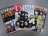
We flicked though some music magazines such as Q, Kerrang and NME to get some ideas. We look at many such as James Blunt's 'Some Kind of Trouble' and Linkin Park's 'A Thousand Suns'
These stood out for us as they were different to the rest of the albums in the magazines. Linkin Park's was simply black and white but the contrast caught your eye. James Blunt's also had a contrast with the child with the blue sky behind them. There is also a slight resemblance to Nirvana's Album 'Nevermind'.


These gave us ideas to help our to stand out such as using contrast to catch the attention of the person. It would also relate to the genre of soft rock as it can be colourful unlike the metal genre where you expect dark or lack of colours.


We then split of into pair to do either the advert or the album cover. Me and Tom did the Album cover and Ollie and Lucy did the Advert. Me and Tom worked together making sure that our parts were closely linked and similar. This included using the same font, colours, style and theme. In this case it was based around a pirate treasure map, as we agreed that it was relevant to the title of being adventurous.

Ollie and Lucy based the advert on James Blunt's advert of a picture of him torn vertically multiple times. This was a good idea as it relates to the music video of a relationship ending and as if they girl had ripped up his picture in anger. Instead of a picture of someones face they had a picture of a man (Tom) looking into the distant sunset with a acoustic guitar resting against a rock. This relates closely to the genre of the album that we are trying to portray and I believe that we were successful in creating a Advert and Album cover that is both relevant and suiting for the genre and theme.

Evaluation 4 - How did you use new media technologies in the construction, research, planning and evaluation stages?

Evaluation 4 - How did you use new media technologies in the construction, research, planning and evaluation stages?

Harry Read
Candidate Number: 6152


Technology was a key factor in making this product as it helped make process easier, quicker and possible. We used a variety of hardware and software. Hardware includes Cameras, Computer, Mac, Tripod etc whereas software is everything digital so Internet Explorer, Final Cut Pro, Serif PhotoPlus etc.


Hardware:


Mac
For editing and all the music video based work we used the Macs. These are incredibly useful for media based tasked such as editing, recording but we found other tasks such as research, drawing, and creating written documents easier on the PCs. None the less the Macs played a vital role in making the final product.

PC
For researching and other tasks not media based, we found easier on the PC as we are more use to them. We all used them to create our Advert and Album Covers as well as other task like emailing, backing up etc.

Camcorder
The most important piece of equipment that we used to make the product. It was easy to use and had good sound. We used this combined with the tripod to produce effective and quality footage. We would link this to the Mac and upload the footage that we had captured so it can be edited and combined with other clips.

Tripod
A simple device comprising of a flat surface to put the camera on and 3 adjustable legs. This gave stability to the footage making it easier to watch and understand.

Digital Camera
We used a high quality digital camera produce the stop motion such as the karma sign. This was linked up to a computer so we could transport the pictures via email or memory stick to the Macs back in school.


Software
Final Cut Pro was the powerful and useful editing software that we used on the Macs. It allowed us to make complicated yet effective transactions and effects etc. We imported the music in to this to allow us to line it up such as lip syncing. I was fairly simple to use but also allowed for more advance editing techniques and skills to be used.

Internet Explorer
Was the web based software that we used allowing us to research, communicate and download the information we needed. It was also used to transport media items such as songs, picture and footage from one computer to another. We also used it to access YouTube for research into ideas of stop motion as well as Blogger which we used to write this blog.

Serif PhotoPlus
We used this drawing software to create our Adverts and Album Cover. I was easy to use and allowed to to designs and create the ideas our ideas. It also made it look a lot more professional thanks to all the features such as editing picture and tweaking colours, saturation etc

Evaluation 4 – How did you use the new media technologies in the construction and research, planning and evaluation stages?

Lucy Carballo
Candidate Number :- 6046


Through-out the construction, research, planning, and evaluation stages my group members and I used both hardware and software, without both of them we would have not being able to complete out unit. A definition of hardware is “a general term for the physical artifacts of a technology” and a definition of software is “a general term primarily used for digitally stored data such as computer programs and other kinds of information read and written by computers.”


The hardware I used:-

Computer: 
We used a computer through-out the whole unit for a variety of different of different reasons. The hardware, a computer includes a monitor, tower, mouse, and keyboard. It has been particularly useful for e-mailing, editing photos using different software such as “Adobe Photoshop”. We created our album cover and magazine advert on the computer using other software, such as paint. Most importantly we could not have used the internet without a computer.
iMac: 
Through-out the unit, Oliver mostly used the iMac as he owns one at home so has the most knowledge about how to use the software, such as iMovie. He used this to create the music video by placing all the clips we had filmed together and edited them to the way that we all liked as a group. By watching Oliver over the past couple of months I have learnt how to use the iMac. Like the computer this has also been a piece of hard drive that can connect to the internet used to do research, this piece of hardware was very important to us in the making of our music video!
 
Tripod:  
This was used occasionally through the filming of our music video to hold the camera on it so the camera would not move giving the audience a clearer picture without it blurring at all as this would result in the person watching the video to miss out on some parts.


Cameras: 
We used both a Phone camera and a normal camera to take pictures which we used in our music video during the couple of seconds of stoke motion and images used for our album cover and album magazine advert. The phone camera was a cyber shot, HD 5 mega pixel camera and the normal camera was a 14.1 mega pixel ‘Casio’ camera.


Camcorder:  
We used this to film our music video. Harry looked after the camera as he was the camera man knowing the most about important factors such as lighting and sound. Without this piece of hardware we would not have been able to make a music video.


The software I used are: -
 

Internet Explorer: 
We used the software Internet Explorer through-out the whole process of planning my music video, magazine advert, and album cover, and could not have successfully undertaken research without it! It is quick and easy to use, holding all the information I needed to know by just typing into a search engine such as Google what I want to find, which then leads us to many other of thousands of WebPages. However some information may be inaccurate, which was an element my group and I needed to consider when using the internet resulting in double checking the information twice over.

Click above to go to http://www.blogspot.com/

The internet gave us access to web sites that was essential for us, such as blog spot.com which was the website we used to create our online blog, and also Youtube.com, which we used to research into many aspects such as visually showing Goodwin’s 6 rules and examples of our music genre.  
Paint: 
We used paint mainly towards the end of the unit, for our album magazine advert. We used this to help edit our picture of Tom standing in the distance with the guitar. We used paint to tear the picture up – or what is seemed to be torn up! Paint is a very simple and easy programme to use, but is very effective and works very well.

Adobe Photoshop: 
Like the piece of software, “Paint”, Adobe Photoshop, was used at the end of the unit on our album magazine advert and also by Tom and Harry for the actual album cover. When Oliver and I first started to use this piece of software neither of us knew anything about it, but as we played around on it, we got to grasp with it. I now know about the gradients and the many different of effects you can use.

Microsoft PowerPoint: 
We only used PowerPoint once during the Unit, right at the beginning when my group members and I put together our first initial ideas about which band we have gone with, discussing the genre of the song and our first draft of our ideas for our music video. We appointed a slide so each section we brainstormed, such as mise-on-scene.

Microsoft Word: 
We used Word throughout the whole of the unit. We used it to write down all our research neatly to then copy it onto our blogs, write things onto word to print out in a nice neat document, or just to store our work away on the computers hardrive so it won’t get lost or miss placed that it might have done if it were printed off.

Final Cut express: 

This final piece of software was the most important to our group in the making of the music video. As Oliver had the most knowledge about iMacs, he also knew the most about the software on iMacs, including Final Cut Express. We used this software to upload all our movie clips and photos, to place it with our song, "jump". It also allowed us to edit the frames by adding special effects, changing the brightness, and many more. Without this piece of software we would not have been able to place the movie clips and the song together as easily as it has been. As i have been watching oliver on Final Cut Express for the past few months i have picked up a lot, and would be able to make my own, on my own.

Evaluation 2: How effective is the combination of your main product and ancillary texts?

 Lucy Carballo
Candidate Number :- 6046

As a group, we decided to go with an album title that could be linked with many aspects of our music video and the genre of it, being spectacle and narrative. We chose “The New Adventures Of...” mainly because our music video revolves around moving on from a relationship, which opens up a whole new adventure. In addition to this as “Get Set Radio” – our chosen band, are new this first album is a new adventure to them. Our song that we made a music video to, “Jump” is an example of soft rock, so we decided to bring that into the album title also, through the design.


The process of planning the design for our advert was quite a long process, which we dotted down as a brainstorm on a large piece of paper, we all had a variety of different ideas. We looked through several music magazines from all genres such as Q, NME and kerrang, when we then came across James Blunts adverts for his new album “Some Kind Of Trouble” (See image to the right). We thought it was quite a simple idea. Looking at solely the album cover we thought it was quite a simple idea, with the main attention being drawn to the baby, which links to the title. The rest of the album is quite simple with just the general background, which I feel the audience would not really look at as the baby is placed in the centre of the album. The advert itself was mainly the album cover, but to the left of the album was a torn up picture with all the information about the album such as release date on that part so not covering any part of the album up. At this point we split into two separate groups, being Oliver and I, who carried on with the magazine advert and Tom with Harry, starting on the actual album cover with a separate piece of paper with a group brainstorm we placed together on all our thoughts of the album cover, which included a treasure map, autumn leaf, and a instrument used in the video such as a drum kit. Below is an image of some of these ideas that we drew out.


Oliver and I decided to link our groups brainstormed ideas with the James Blunts advert. We placed our idea of an instrument being centre of the page- indicating soft rock, with the picture being torn up – indicating a new start (new adventure). I feel that our album cover and magazine advert for the album are very good and have both successfully combined the theme of title “The New Adventures Of ...” and the soft rock genre. I am personally very happy with our final album magazine advert (as shown to the left).

Evaluation 4 - How did you use new media technologies in the construction and research, planning and evaluation stages?

Thomas Rivet
Candidate Number: 6159

The use of various media technologies in the construction and research, planning and evaluation are always as crucial as the final outcome. Many types of mediums were utilised in the relative process stages, for both the advert and album cover (ancillary texts) and main product (music video), these mediums were devised in 3 categories; construction and research, planning and evaluation:

[CONSTRUCTION&RESEARCH]
Camera-  My camera was used to capture the location and stop-motion photographs for our main product [music video]. Furthermore, my camera was made and designed by 'Casio' with an astonishing 14.1mp (megapixel), enabling it to capture photographs with quality and greater resolution. In addition to this, it had a High Definition (HD) feature.  We used this feature wisely so that our photographs were always of the highest standard, opposed to the default Standard Definition (SD) feature. With this greater photograph resolution, I was reassured that we would not confront any pixelation issues when it came to transferring them onto the computers. And finally, this device was used to take photographs of our apparatus for our evaluation stage.

Camcorder- This instrument was used to gather the footage of myself singing to the lyrics and rhythm of the song for our music video. Morever, as I have already had some experience with this 'portable electronic recording device capable of recording live-motion video and audio for later playback', I could focus more upon other aspects of mise-en-scene, such as costumes, setting and location. 

Tripod- Is a three-legged rack, in which we used for camcorder support. This instrument was used in the construction stage of our main product [filming of our music video]; it was used to gather still footage for our music video. 

YouTube.com-This website was used for music video research and analysis. The research enabled us to identify what the common aspects of soft rock/alternative rock band music videos resembled. From the results, we could construct a set of forms and conventions that we could either decide to follow or challenge.

Blogger.com- 
Also a website that was used in the construction of our research, planning and evaluation for the promotion of our main product and ancillary products. Our photographs and texts would be added to our blog located on this worldwide website, consequently making it easier for you as a viewer to see.  
[On the right- 'Blogger.com' layout homepage - Click on Image to enlarge.]

The use of visuals like images/illustrations/photographs would enable us to demonstrate our better understanding of the various use of mediums that could be included in this blog. For instance, Powerpoint presentations and YouTube [music] videos can be shown through the use of embedding coding

'Embedding coding' is a process that permits a viewer to see part of another website without actually accessing it, ultimately converging a considerable number of medium types into one, on one website. Blogger.com does this very effectively. Media convergence is an effective way of presenting your knowledge and understanding of a subject that revolves around medium usage and the blog is an excellent example of where these technology traits can be shown.
[Right - Click on image for a greater insight (and image resolution) into how you can embed a video onto your blog, other examples can be found in research&planning related posts].
Below you can find an appropriate example of embedding coding.

Throughout this stage, numerous new media technologies were used, but some were used for diverse purposes to especially ease the conversion of pictures from another program. 
In some cases, 'Print Screen' was used. This basic case is located on the top right-hand side of your keyboard. Then, these 'Full Screen Captures' would be transferred onto any software that enabled you to 'Paste' it. Here are the functional softwares/programs that were used in both the contrusction&research and planning stage:
  • Paint (see below)
  • Microsoft Word 2007 - This Windows XP program was used, similarly to Paint, for the rescaling of pictures. This program is much more effective as it enables you to rescale them with much less hassle.
  • Microsoft Powerpoint 2007 - Powerpoint was mainly used for the evaluation. As you may have seen above, the colourful set of words in the 'What have you learnt from your audience feedback?' post, was created using the text fonts and styles from this program.
  • Microsoft Publisher 2007 - Another Microsoft program. However, this one was much more beneficial to the creation of one of our ancillary products - the advert. Although I did not take much part in the making of this product, I know that this program was used as I was the one who managed to reformat this file (due to minor complications in the conversion of the file) to a format that could be saved as a jpeg file.

Windows XP&iMACs-
For the construction&research stage to function adequately, we had a choice of two seperate types of computers. 
First, the Windows XP. And second, the iMACs. We used them in order of their function and on-screen benefits, looking at both their strengths and weaknesses/limitations.

For instance, the Windows XP computer/laptop was only employed when: 
  1. The blog needed altering (in all 3 stages), 
  2. Certain softwares that were needed were not apparent on the iMacs - such as Photoshop, Serif PhotoPlus, Picasa 3, GIMP v2.6 and Paint.
Whereas the iMACs were only utilised when: 
  1. Music video footage had to be added and edited using Final Cut Express Pro or iMovie HD [creating the music video DVD]. 
  2. Also, the still images of our music video were also adopted from the use of the 'grab' feature on the Final Cut Express Pro software.
Overall, I would say that the iMAC was frequented more than the Windows XP computer, as the editing took up most of the time spent on our main product, opposed to the time spent on our ancillary products on the Windows XP computer. 
As previously mentioned above, our group decided to combine the use of several softwares to reach the final outcomes for our music video and digipak [album cover and advert]. 

These softwares range from simple Image Manipulation to complex Editing.

GIMP v2.6- Also known as GNU Image Manipulation Program was used in the making of the front cover and inside right-hand part of the album cover of our digipak. I decided that this program was best suited for the creation of some bits off the album cover as it includes a simple and thoroughly thought user-friendly interface. Moreover, some of the effects I had used included: Colourise, Cartoon, Posterise and Gaussian Blur.  This program was purely used in the construction stage of one of our ancillary texts [album cover].

Serif PhotoPlus X2-  As clearly said in the title, this is a photograph editing software. Unlike the use of GIMP, this programs use concentrated more upon altering some of the aspects of a chosen illustration/photograph. This program was mainly used in the editing stage of the advert. If used appropriately, a nicer finish can be achieved. 


Paint- Renowned for its basic and uncomplicated layout and interface, this Windows XP program was utilised in the construction&research stage of our ancillary texts (both the advert and album cover - digipak). Its primary use revolved around straightforward photograph scaling, as seen on the image on your right.

Picasa 3-
Was a frequently used Windows XP/Vista that was normally used after the image-making stage using GIMP v2.6.  For instance, I decided not to use the 'text' feature on GIMP as I knew from previous experience that it lacked complexity and depth. For this reason, I devised that I would use the Picasa 3 'text' feature instead. It had an amplitude of text fonts and sizes to choose from, in addition, I was able to establish what sort of outline I wanted for the chosen fonts to be included on all sides of the album cover.
Above is an image of some of the stages in which my GIMP-made compass went through after the editing stage. Text was added and the compass was tilted to hopefully increase the effectiveness of this illustration to the viewers/customers.
Final Cut Express Pro- Is the MAC editing software that we used for the editing stage of the music video making process. This software enabled us to insert effects and transitions into and between the footage to make sure that continuity was apparent and intact - as the genre of music video was a narrative.  Although Oliver Rossetti was our Chief Editor, I did manage to improve my knowledge and understanding of this software, therefore, as well as being useful in the construction stage of our main product, it was also beneficial to my learning of this specific MAC editing software.

iMovie HD- Another iMAC software. However, this one was not used as much as the previously mentioned one as it isnt as developed and complex as Final Cut Express Pro, we had only used it to upload and import the stop motion photographs on the MAC from the USB stick, where the photographs were taken from the Windows XP computer at home, subsequenty from the Casio Camera to a USB stick [above]. 

[PLANNING] 
Our planning stage was fundamentally shown on this team blog. Notes and comments on how we decided to use these can be shown above. See 'Blogger.com' for more information.

However, here is another brief outline of its usage. We agreed that we would be more inclined to add to the blog after we had generated a concrete set of ideas through spoken form, to then be noted on paper and then later be added onto this cyber-space [blog] where all the information and details about our band promotion thoughts and motives can be shown.


[EVALUATION]
To conclude, the evaluation stage. 

From the beginning of this project process, one must have noticed that all the construction&research and planning has been shown on this blog.  Moreover, to enable you to more easily correlate my understanding of medium use, my evaluation has also been displayed on this blog. 

A 'blog' - short for 'Web log' is generally used for the frequent sharing of thoughts and ideas. And although writting this evaluation was the task set, I believe that I have adequately used this blog for its primary purpose for the benefit of the project.

Additionally, even though blogs have only been on the net for the past 11 years (blog usage spread during 1999 and the years following), we could still speculate that 'blogging' is a relatively new aspect of internet-related technology. And if you have just read all of the above, then it just proves how effective this form of technology is, as you are able to read this from another computer.

Sunday, 12 December 2010

Evaluation 2: How effective is the combination of your main product and ancillary texts?

Oliver Rossetti
Candidate No. 6164

Our music video genre is predominately spectacle and narrative based, telling the story of how a woman leaves her boyfriend and finds someone else while her boyfriend attempts to persuade her to "come back around". Then in addition to this we show the rock side of the artist through the spectacle effects that are used throughout the music video.

We decided as a group that our album name should reflect that of the genre and how the man experiences a journey through a relationship and its goes ups and downs. We the influence of our original artist who made the song - Get Set Radio; we came up with the album title name of "The New Adventures of..." reflecting that of the adventure the man (the artist) travels upon through life.
The idea that we have soft rock genre of song, we wanted to find an advert that best related to this genre. We looked at several magazines and then I found the advert of Linkin Park's - 'A Thousand Suns' on the first inside page of the new Q Magazine. This gave me the idea for the magazine advert of positioning and how it is particularly eye-catching with a distorted picture in the middle and bold titles at the top and bottom of the magazine page.
I then continued through the magazine and found a perfect advert where the artist is known for his songs based on stories such as "Stay the Night" and "You're Beautiful". The advert for James Blunt interestingly was split up into two and one half was a picture of the artist himself but torn up into strips while the other half was the album cover (as seen on the right). I found you could immediately tell that this album was narrative based as the torn strips show how he, himself, has caused the "Some Kind of Trouble" I suggested the strips would be a great touch to our already developing magazine advert as the picture could be of our artist looking out upon a sunset and the horizon - having connotations of remembrance, love and ultimately, the telling of a story behind it.


Now you may have noticed I have not talked much about the album cover in relation to our music video or the magazine advert. We paired off to tackle the creation of the two ancillary products to make the most efficient use of our time but always keeping in communication about progress and ideas through regular meetings every couple of days - making sure we kept on the same style for our marketing aspects of the music video. Lucy and I decided together that we did not want to fully link our magazine advert to the album **, as we felt the consumer would be better caught by having more a bold complex picture encrypted with clues to the album which would be different to the album cover as the consumer would first wonder what the brightly coloured picture is trying to advertise before seeing the smaller shot of the album cover below with text beside saying that its available to download and will be sold at HMV Stores on release date.

As our album is called "The New Adventures of...", we decided to focus in on the "Adventure" part while keeping in mind the genre of our music video to create our album cover. The first connotations of "Adventure" that we all came up with are as seen below:
     
Picture: The yellow highlighted designs were my first suggestions
towards the connotations of "Adventure". The remaining are designs made by my group.
The blue highlighted design was the final album cover design that we came to by collating our ideas.


After reaching our final design, I suggested that we make the actual map so that it looked naturalistic but then we super-impose the artist's name, "Get Set Radio", and the album title, "The New Adventures of..." as I felt we wanted the artist and album name to stand out from the image as I had seen in analysing album covers at HMV. On top of this, it also made it far easier to create as Tom did not have to spend a lot of time drawing and perfecting the font style. In terms of font style we chose to use "Andre SF" as the style, we felt, related to our adventure theme that we were focusing on and we wanted to make this title stand out and what better way than through the font.

I feel that both our album cover and our magazine advert for the album have been successful, combining with our music video with the theme of "adventure" as the predominate theme running through all three, mainly linking the narrative style of the video and the album name.

Evaluation 3 - What have you learnt from your audience feedback?

Oliver Rossetti
Candidate No. 6164


Above are the words that we got back in response to our audience feedback
after the rough cut of our music video
.

By carrying out the process of an audience feedback session after the rough cut and then after the music video has been finished and like-wise for our ancillary products; it has allowed my group and I to alter and change certain areas of that product to improve and have the intended effect on our audience.

In terms of our music video, the response we got back after the rough cut had been completed was positive with comments such as "The stop motion is great" and "Clever shots with the split images". However it was positive but taking in an account some of the negative feedback we got, I felt it was only satisfactory with room for improvement. Some of the negative feedback we received was that "Occasionally lip Syncing is slightly off" and "Don't understand the blank spaces at the beginning". These and other comments taught me a great deal about what makes a good music video and as the editor, I consequently took these on board and went back to start stage two of editing; perfecting the inaccuracies of the rough cut.


After taking many hours of editing, we then submitted the music video to the final audience feedback questionnaire. Some of the comments and responses can be seen below:

Above are the words that stood out to us from the comments that we received after
I had corrected many aspects from the first audience feedback session.


As you can see, some real progress was made between staging, having far less negative feedback, meaning that I only had to take an hour or two to perfect the music video that touch more as I had missed one clip of lip-syncing that had moved by a millimetre making it not tie in with the visuals brilliantly as well as I corrected the particular frame where the drums weren't matching exactly with the bass of the song and took away the beginning titles of the song as one audience member, Conor, rightfully pointed out that the likes of MTV and Smash Hits would do that automatically (See left). However, a comment was made about the lack of emotion in the artists expressions at a certain clip. Unfortunately this came too late in the editing stage to correct due to the time available to us, however, we did want to overdo the expression when singing as well as our artist (Thomas) has never had experience of a music video and when speaking to him, he did comment and say that he would bare that in mind for next time like-wise so would I have change it if there was the time.
In terms of the ancillary products, we had one formal peer audience feedback in which it was highlighted about needing to include a few more pictures of our artist/band on the album covers as typically most first artist's albums include an image of themselves on it, we therefore altered our album cover as we realised this was true and had been initially overlooked. On the topic of our magazine advert, it was very well received with no criticism and only a suggestion. The suggestion was that the picture looked slightly plain with black tears down the middle, when it could be made far more interesting and stand out but displacing each strip of the photo - making the overall advert look ten times more interesting to the readers eye.
All in all, I feel the audience feedback has been extremely valuable in the process of our music video and our ancillary products. I do not honestly believe that we would have become anywhere near professional, industry standard had it not been for our audience feedback. The professional, industry standard is where everyone aims to be and I hope that the audience will very much enjoy watching and listening to our music video while taking in the art of our ancillary products.